Agentic commerce App
Agentic commerce App
Agentic commerce App
Product Designer
Product Designer
Contract
Contract
Beep is an AI-powered platform built to help users book flights and, eventually, access everyday services from one place.
I worked on the product from its early MVP to V2, shaping the conversational experience, booking flow, passenger details, payments and profile architecture. V1 was built to communicate the larger vision and test product viability with investors and early testers.
V2 is the live product, with the flight experience shipped and the wider product still evolving.
Designing an AI-first flight booking experience
My focus: Product design · UX · UI · Conversational UX · Interaction design Status: V2 live on Play Store
My focus: Product design · UX · UI · Conversational UX · Interaction design Status: V2 live on Play Store
My focus: Product design · UX · UI · Conversational UX · Interaction design Status: V2 live on Play Store

The challenge
Beep was not meant to be another flight-booking app. The long-term vision was to create a single AI-led destination where users could ask for what they need instead of navigating through multiple service-specific flows.
But the initial product was starting with one use case: Flight and Hotel Booking.
That created an interesting design problem:
How do we make the current experience useful without making the product feel limited to flights?
At the same time, the AI experience had to work with real constraints from external booking partners. Users expected to speak naturally to Beep, but some information still had to follow rigid formats.
So the design challenge became less about creating screens and more about finding the right balance between:
Conversational AI and structured interactions
Simplicity and required information
A current flight experience and a much bigger product vision
Fast actions and user trust
But the initial product was starting with one use case: Flight and Hotel Booking.
That created an interesting design problem:
How do we make the current experience useful without making the product feel limited to flights?
At the same time, the AI experience had to work with real constraints from external booking partners. Users expected to speak naturally to Beep, but some information still had to follow rigid formats.
So the design challenge became less about creating screens and more about finding the right balance between:
Conversational AI and structured interactions
Simplicity and required information
A current flight experience and a much bigger product vision
Fast actions and user trust
The challenge
Beep was not meant to be another flight-booking app. The long-term vision was to create a single AI-led destination where users could ask for what they need instead of navigating through multiple service-specific flows.
The first version was intentionally an MVP.
It helped us test the concept, communicate the broader vision and understand whether an AI-led experience could work for travel.
Making the bigger vision visible
Even though flight and Hotel booking was the immediate use case, I didn't want users or investors to perceive Beep as simply another flight app. The home screen needed to communicate that flights were only the beginning.
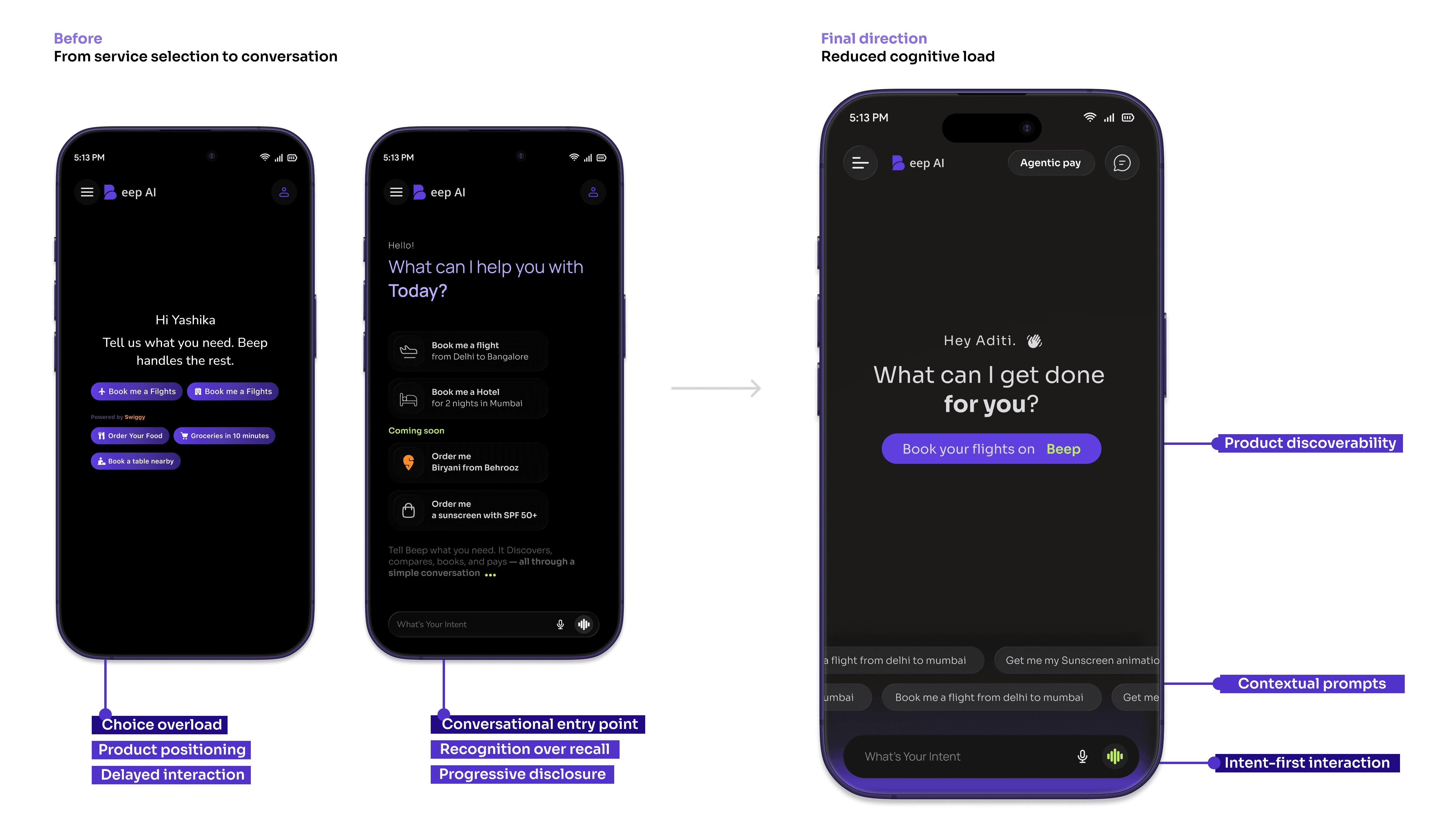
The V1 home screen explored two directions.
One used chips such as:
Book me a flight
Book me a hotel
Order food and groceries
And the other
“What can I do for you, [Name]?”
The services that weren't available yet were labelled as coming soon.
This was a deliberate choice.
V2: Removing the decision before the conversation
As more services entered the roadmap such as Uber, Zepto, skincare brand with 82 other merchets from different industry. The number of possible chips would continue to grow. More options meant more decisions before users could even talk to Beep. That added friction to the most important action:
STARTING THE CONVERSATION. So I changed the home experience.
Instead of presenting multiple service choices upfront, V2 brings the user directly into the AI experience. The new home screen focuses on:
Starting a conversation with Beep
Lightweight prompt suggestions
A subtle animation communicating what Beep can help with
The broader product vision without making users choose a service first
This reduced the amount of decision-making on the first screen while still communicating that Beep goes beyond flights.
The principle: Don't make users decide how to use an AI product before they've started using it. This became one of the key shifts from V1 to V2.
From MVP to a real Product Decisions
The initial MVP focused on one thing: Book a flight through AI. But Beep was always intended to become more than a flight app. The challenge was to make the current experience useful while leaving room for the larger vision.
V1 → communicate the vision
V2 → improve the actual experience
01. Getting users into the conversation
The problem
V1 used multiple service chips to communicate everything Beep could eventually do.
Book a flight · Book a hotel · Order food · Buy groceries
This worked for communicating the vision, but as more services were planned, the home screen started asking users to make too many choices before they had even started talking to Beep.
The change
I moved from a service-selection homepage to a conversation-first homepage.
The user can start with Beep directly, while lightweight prompts and animation still communicate what the product can do.
02. Making structured data feel conversational
The problem
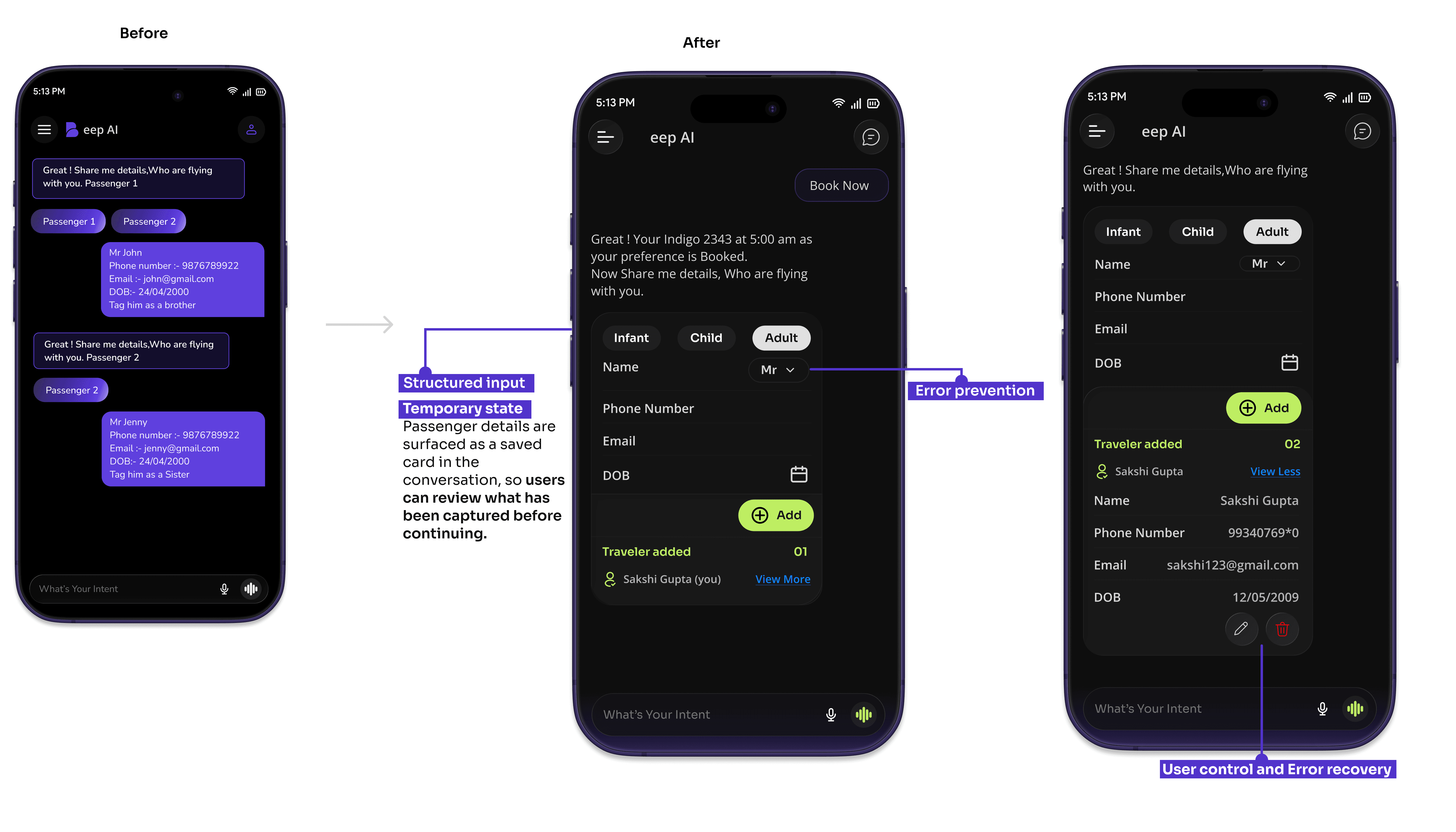
The AI asked users to enter passenger information through chat.
But the booking partner required strict formats:
Mr/Ms + Name
DD/MM/YYYY
Adult / Child / Infant
For first-time users, typing these details correctly created unnecessary friction. The backend constraints couldn't be changed, so the solution had to happen in the experience.
The change
I introduced a passenger card inside the chat.
Instead of making users remember formatting rules, the interface guides them through the required information.
02. Making structured data feel conversational
The problem
The AI asked users to enter passenger information through chat.
But the booking partner required strict formats:
Mr/Ms + Name
DD/MM/YYYY
Adult / Child / Infant
For first-time users, typing these details correctly created unnecessary friction. The backend constraints couldn't be changed, so the solution had to happen in the experience.
The change
I introduced a passenger card inside the chat.
Instead of making users remember formatting rules, the interface guides them through the required information.
03. Making agentic payment understandable
The problem
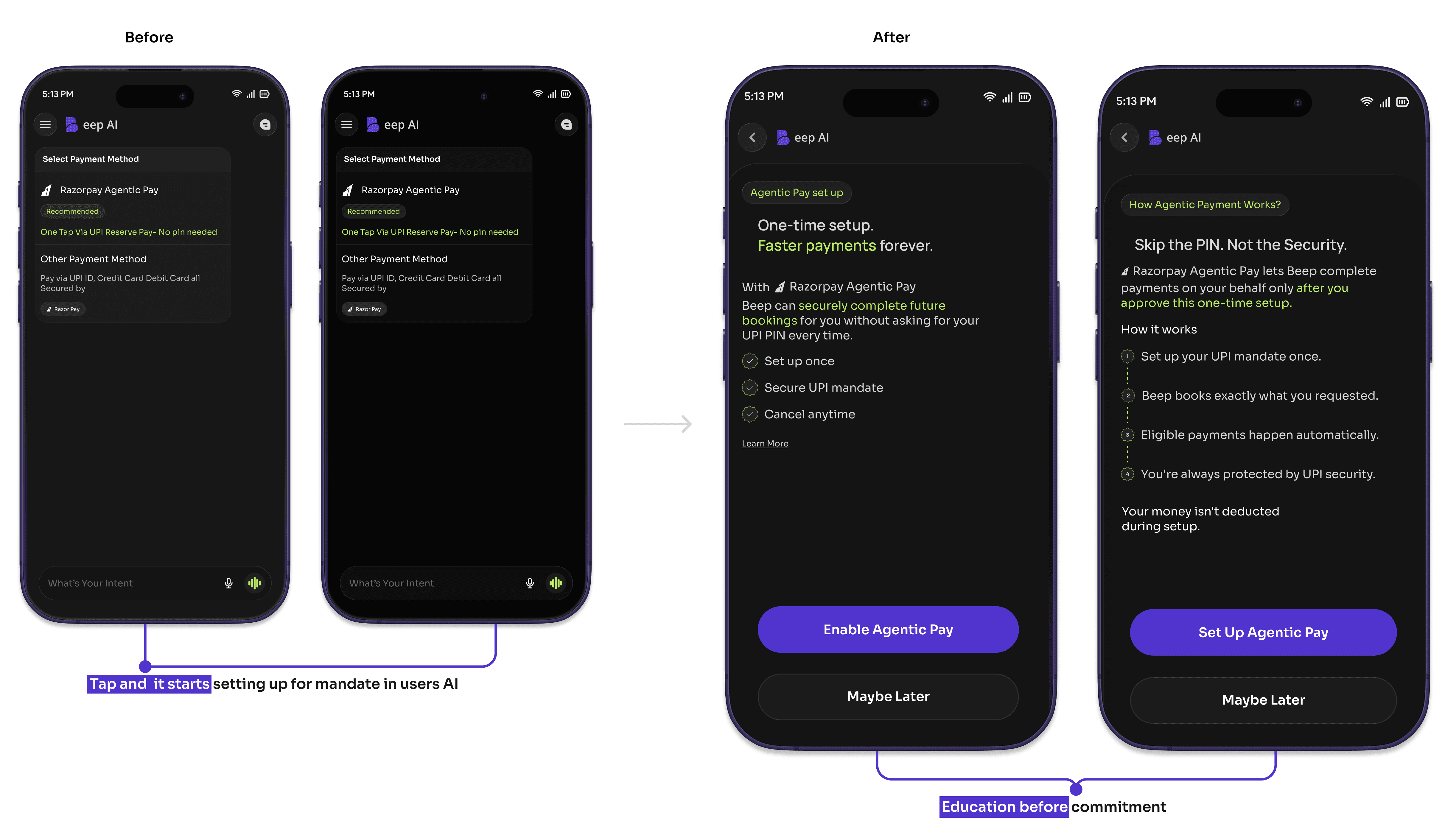
Beep introduced agentic payment—a faster payment experience where users could authorize payment through the AI experience.
But payment is a high-trust moment.
A simple “one-tap payment” isn't enough when users need to understand what they are enabling.
The earlier experience presented the payment option, but I redesigned the flow to explain it before asking users to activate it.
The change
I created a short guided introduction explaining:
What it is → how it works → what the user is enabling → activate
I also added an Agentic Payment toggle inside Beep's settings so users could easily turn it off.
03. Making agentic payment understandable
The problem
Beep introduced agentic payment—a faster payment experience where users could authorize payment through the AI experience.
But payment is a high-trust moment.
A simple “one-tap payment” isn't enough when users need to understand what they are enabling.
The earlier experience presented the payment option, but I redesigned the flow to explain it before asking users to activate it.
The change
I created a short guided introduction explaining:
What it is → how it works → what the user is enabling → activate
I also added an Agentic Payment toggle inside Beep's settings so users could easily turn it off.
|
|---|
So I used the interface to absorb that complexity.
The common thread:
When the system couldn't become simpler, I made the interaction simpler.
|
|---|
V1 → V2, V1 helped prove and communicate the idea.
V2 took those learnings into a live product and refined the experience based on tester and user feedback, while working within real technical constraints.
V1 → Explore the concept → Test viability → Communicate the bigger vision
V2 → Refine the experience → Reduce friction → Communicate the bigger vision
What this project taught me
AI doesn't mean everything should be chat. The strongest experience often came from combining conversation + interface.
Constraints can improve UX. Technical limitations pushed me to find simpler ways for users to complete structured tasks.
Trust needs to be designed. Especially when AI starts making actions involving money.
Design has to evolve with the product. The V1 and V2 differences weren't just visual changes. They reflected a shift from proving the idea to improving the product.
The product is still evolving, Beep is now live with V2 and the flight experience shipped. The larger vision is still being built.
My role in the project continues to be about figuring out how an AI-first product can feel simple enough to use, structured enough to work, and trustworthy enough to act on.
But the initial product was starting with one use case: Flight and Hotel Booking.
That created an interesting design problem:
How do we make the current experience useful without making the product feel limited to flights?
At the same time, the AI experience had to work with real constraints from external booking partners. Users expected to speak naturally to Beep, but some information still had to follow rigid formats.
So the design challenge became less about creating screens and more about finding the right balance between:
Conversational AI and structured interactions
Simplicity and required information
A current flight experience and a much bigger product vision
Fast actions and user trust
The challenge
Beep was not meant to be another flight-booking app. The long-term vision was to create a single AI-led destination where users could ask for what they need instead of navigating through multiple service-specific flows.
The first version was intentionally an MVP.
It helped us test the concept, communicate the broader vision and understand whether an AI-led experience could work for travel.
The first version was intentionally an MVP.
It helped us test the concept, communicate the broader vision and understand whether an AI-led experience could work for travel.
Making the bigger vision visible
Even though flight and Hotel booking was the immediate use case, I didn't want users or investors to perceive Beep as simply another flight app. The home screen needed to communicate that flights were only the beginning.
Making the bigger vision visible
Even though flight and Hotel booking was the immediate use case, I didn't want users or investors to perceive Beep as simply another flight app. The home screen needed to communicate that flights were only the beginning.
The V1 home screen explored two directions.
One used chips such as:
Book me a flight
Book me a hotel
Order food and groceries
And the other
“What can I do for you, [Name]?”
The services that weren't available yet were labelled as coming soon.
This was a deliberate choice.
V2: Removing the decision before the conversation
As more services entered the roadmap such as Uber, Zepto, skincare brand with 82 other merchets from different industry. The number of possible chips would continue to grow. More options meant more decisions before users could even talk to Beep. That added friction to the most important action:
STARTING THE CONVERSATION. So I changed the home experience.
Instead of presenting multiple service choices upfront, V2 brings the user directly into the AI experience. The new home screen focuses on:
Starting a conversation with Beep
Lightweight prompt suggestions
A subtle animation communicating what Beep can help with
The broader product vision without making users choose a service first
This reduced the amount of decision-making on the first screen while still communicating that Beep goes beyond flights.
The principle: Don't make users decide how to use an AI product before they've started using it. This became one of the key shifts from V1 to V2.
From MVP to a real Product Decisions
The initial MVP focused on one thing: Book a flight through AI. But Beep was always intended to become more than a flight app. The challenge was to make the current experience useful while leaving room for the larger vision.
The initial MVP focused on one thing: Book a flight through AI. But Beep was always intended to become more than a flight app. The challenge was to make the current experience useful while leaving room for the larger vision.
V1 → communicate the vision
V2 → improve the actual experience
01. Getting users into the conversation
The problem
V1 used multiple service chips to communicate everything Beep could eventually do.
Book a flight · Book a hotel · Order food · Buy groceries
This worked for communicating the vision, but as more services were planned, the home screen started asking users to make too many choices before they had even started talking to Beep.
The change
I moved from a service-selection homepage to a conversation-first homepage.
The user can start with Beep directly, while lightweight prompts and animation still communicate what the product can do.
02. Making structured data feel conversational
The problem
The AI asked users to enter passenger information through chat.
But the booking partner required strict formats:
Mr/Ms + Name
DD/MM/YYYY
Adult / Child / Infant
For first-time users, typing these details correctly created unnecessary friction. The backend constraints couldn't be changed, so the solution had to happen in the experience.
The change
I introduced a passenger card inside the chat.
Instead of making users remember formatting rules, the interface guides them through the required information.
03. Making agentic payment understandable
The problem
Beep introduced agentic payment—a faster payment experience where users could authorize payment through the AI experience.
But payment is a high-trust moment.
A simple “one-tap payment” isn't enough when users need to understand what they are enabling.
The earlier experience presented the payment option, but I redesigned the flow to explain it before asking users to activate it.
The change
I created a short guided introduction explaining:
What it is → how it works → what the user is enabling → activate
I also added an Agentic Payment toggle inside Beep's settings so users could easily turn it off.
Making Agentic Pay visible without adding friction
The problem
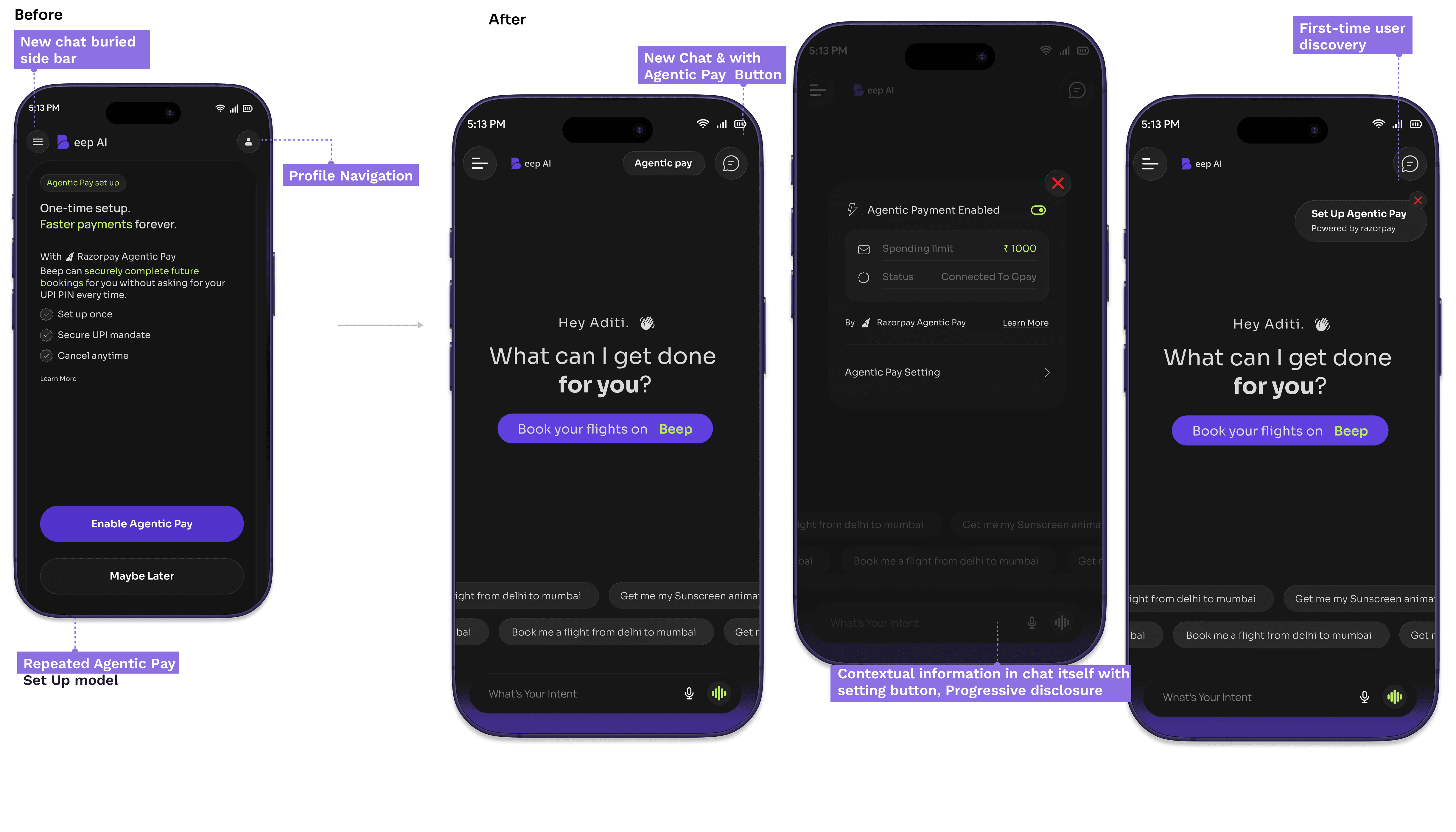
Agentic Pay was an important business requirement, but the existing experience created friction.
Users had to visit Profile → Settings to manage their mandate, while first-time users were repeatedly shown the setup prompt when opening the app.
The goal was to make Agentic Pay visible without making it intrusive.
The change
I moved Agentic Pay closer to the core conversation and separated discovery, setup and management into clearer touchpoints.
The UX shift
Forced setup → Discover → Understand → Manage when needed
Instead of repeatedly asking users to enable Agentic Pay, I made it visible, accessible and user-controlled.
Making Agentic Pay visible without adding friction
The problem
Agentic Pay was an important business requirement, but the existing experience created friction.
Users had to visit Profile → Settings to manage their mandate, while first-time users were repeatedly shown the setup prompt when opening the app.
The goal was to make Agentic Pay visible without making it intrusive.
The change
I moved Agentic Pay closer to the core conversation and separated discovery, setup and management into clearer touchpoints.
The UX shift
Forced setup → Discover → Understand → Manage when needed
Instead of repeatedly asking users to enable Agentic Pay, I made it visible, accessible and user-controlled.
So I used the interface to absorb that complexity.
The common thread:
When the system couldn't become simpler, I made the interaction simpler.
|
|---|
V1 → V2, V1 helped prove and communicate the idea.
V2 took those learnings into a live product and refined the experience based on tester and user feedback, while working within real technical constraints.
V1 → Explore the concept → Test viability → Communicate the bigger vision
V2 → Refine the experience → Reduce friction → Communicate the bigger vision
What this project taught me
AI doesn't mean everything should be chat. The strongest experience often came from combining conversation + interface.
Constraints can improve UX. Technical limitations pushed me to find simpler ways for users to complete structured tasks.
Trust needs to be designed. Especially when AI starts making actions involving money.
Design has to evolve with the product. The V1 and V2 differences weren't just visual changes. They reflected a shift from proving the idea to improving the product.
The product is still evolving, Beep is now live with V2 and the flight experience shipped. The larger vision is still being built.
My role in the project continues to be about figuring out how an AI-first product can feel simple enough to use, structured enough to work, and trustworthy enough to act on.
So I used the interface to absorb that complexity.
The common thread:
When the system couldn't become simpler, I made the interaction simpler.
|
|---|
V1 → V2, V1 helped prove and communicate the idea.
V2 took those learnings into a live product and refined the experience based on tester and user feedback, while working within real technical constraints.
V1 → Explore the concept → Test viability → Communicate the bigger vision
V2 → Refine the experience → Reduce friction → Communicate the bigger vision
What this project taught me
AI doesn't mean everything should be chat. The strongest experience often came from combining conversation + interface.
Constraints can improve UX. Technical limitations pushed me to find simpler ways for users to complete structured tasks.
Trust needs to be designed. Especially when AI starts making actions involving money.
Design has to evolve with the product. The V1 and V2 differences weren't just visual changes. They reflected a shift from proving the idea to improving the product.
The product is still evolving, Beep is now live with V2 and the flight experience shipped. The larger vision is still being built.
My role in the project continues to be about figuring out how an AI-first product can feel simple enough to use, structured enough to work, and trustworthy enough to act on.
More projects
More projects
Ready to Make Your Brand Success and Unforgettable?
Let's make it happen!
I'm open to full-time product design roles where AI, compliance, and complex systems are the actual brief not an afterthought. If your product has to work in the real world, under real pressure, for real users that's exactly where I do my best work.

Open to roles
Sakshi Gupta
Fulltime
Skills and Tools
Web Design
Mobile Applications
Saas
Design Systems
AI workflow UX
UX Research
Visual Design
What I bring
Compliance-first thinking
AI product experience
Complex systems
Cross-functional collab
Ready to Make Your Brand Success and Unforgettable?
Let's make it happen!
I'm open to full-time product design roles where AI, compliance, and complex systems are the actual brief — not an afterthought. If your product has to work in the real world, under real pressure, for real users that's exactly where I do my best work.
Open to roles
Sakshi Gupta
Fulltime
Skills and Tools
Web Design
Mobile Applications
Saas
Design Systems
AI workflow UX
UX Research
Visual Design
What I bring
Compliance-first thinking
AI product experience
Complex systems
Cross-functional collab
Ready to Make Your Brand Success and Unforgettable?
Let's make it happen!
I'm open to full-time product design roles where AI, compliance, and complex systems are the actual brief not an afterthought. If your product has to work in the real world, under real pressure, for real users that's exactly where I do my best work.
Open to roles
Sakshi Gupta
Fulltime
Skills and Tools
Web Design
Mobile Applications
Saas
Design Systems
AI workflow UX
UX Research
Visual Design
What I bring
Compliance-first thinking
AI product experience
Complex systems
Cross-functional collab